Lollipop Website Redesign
From Summer 2020 to Spring 2021, I worked as a UX Designer to create a new shopping experience for the baby-care e-commerce brand — Lollipop.

Role
UX Designer
Team
UI/UX Designers: Maxxie Lin, Ora Chang, Shao-Yun Sha
Front-End Developer: Merchu Liang
Duration
5 months (Sept. 2020 – Jan. 2021)
Tools
figma, Adobe Creative Suite, Trello
Overview
With 3 designers and Lollipop’s in-house engineering team, I was tasked to co-lead the website rebranding and create the end-to-end design of a centralized brand’s official online store. This website aimed to offer a fun and trustworthy shopping experience for new parents.
In addition, I worked alongside two Industrial Designers and the Marketing team on the product packaging and video campaign in order to coordinate the shopping experience holistically. I stopped working on the project during the detailed visual design phase as the website started to be built.
The official website will be launched globally with Lollipop Tableware on April, 15th, 2021.
*Due to COVID-19 and the postponed product launch date, the website is experiencing delays and currently in the process of getting shipped. Please reach out to me if you are interested in learning more about the development status.

From Lollipop Baby Camera to Lollipop Baby Care
Founded in 2014, Lollipop Baby Camera was born, with integrated features like remote monitoring cry detection, and so on. The product hit Amazon’s best-seller after 10 months of launching and is sold in 13 countries across Europe and North America. After years of research and development, Lollipop is launching a new collection - Lollipop Tableware - and it is in need of a rebranded official website for a better user experience and catering to a bigger market. In the span of 12 weeks, I was part of an ambitious project to lead and redesign the Lollipop shopping experience for the first time.

DESIGN BY ACCRETION
Kickoff
The shopping experience for baby products is ambiguous and troublesome. Most new parents rely on Instagram and Youtube for shopping references and make their purchases via Amazon or third-party’s retailers. Given that, many brands failed to curate a seamless shopping experience on their official sites which should be informative and also deliver the brand’s mission and values. For parents, buying baby products online can be a risky move filled with liabilities such as material safety concerns and inaccurate fit for babies of different ages.
While some resort to Amazon’s Best Seller list, many find the unclear product specs and the lack of transparency of brands and manufacturers frustrating.

Design Opportunity
MARKET SITUATION
Lollipop has the potential of becoming a key player in the western baby care market. While the baby camera itself is widely recognized and recommended by mommy bloggers and influencers, there’s a disconnection with the changing shopping habits of the millennials, which represent around 70% of e-commerce buyers in the last 5 years, and thus the MAU growth remains reluctant.
Our team hypothesized that the brand should go beyond the traditional online shopping navigation and put a strong emphasis on storytelling -
“What makes Lollipop different?”
The selling products are built with playful characters and we want to deliver an official site that also speaks the brand language; our goal is to connect with our new parents and build a loyal consumer community rather than just selling products.

Picking Up by Pieces
RESEARCH
At the outset of the project, we didn’t have a clear mission or specific goals for the baby care shopping experience. With limited pre-exist insights, I conducted a series of research on parents’ shopping habits online.

Exploring the Space
To have a better grasp of the user’s buying experience, my team surveyed 10 mommy buyers. Our goal was to understand the challenges shoppers faced. The questions provided a framework for our research, competitive analysis, and user testing for further development.
-
“For clothing and bigger stuff like baby strollers or furniture, yes! Otherwise, Amazon is my go-to for smaller products, and of course I did my research before purchasing anything for my baby.” - Mom #5
-
“Seems like there’s a lot going on but I’m really not tech-savvy to go through all the features and specs… feel bad saying this but I wish I didn’t have to read through everything to understand how the camera works… also it took me a while to find the shopping cart.” - Mom #2
-
“I personally prefer Amazon just cuz I’m a Prime member, but when the brand has promotions on their site I will buy directly from them if the deal is good!” - Mom #9
THE DISCOVERY
Buyers Love Amazon, And So Do Papas and Mamas
I’m not surprised by the results we found. Although parents tend to do their own research before making any purchase for their babies, many refer to the options that have the best reviews, and Amazon is the most straightforward platform to compare between brands for the same products. Many parent influencers and bloggers even provide links to Amazon and give special remarks on products that are Prime available on their recommendation list.

“You can’t beat the convenience!”
From a business standpoint, many baby brands tend to use Amazon as their primary marketplace and their official sites as the second. Since Amazon provides an all-in-one service for business owners, it’s the most cost-effective for small businesses. However, as a brand becomes more developed and self-reliant, the ultimate goal will be guiding customers back to their own website for better brand exposure and to establish consumer loyalty.

Working Backwards From Perfect
DEEPER INSIGHT
Before I could delve into designing, it was crucial to define success of the shopping experience at scale.
Prior to the redesign, going through countless baby brand sites was our only proxy we could use to investigate other sellers’ strategies and the overall shopping quality. I then came up with a list of questions as metrics to identify the pros and cons of each competitor:
Do they sell on other platforms/marketplace?
Are the instructions on the web seller dashboard clear? What are some pain points listing the item?
What information and guidance are more necessary to include?
How do brands present themselves on their websites? What values do they bring to customers?
How’s Other Brands Doing?
COMPETITIVE ANALYSIS
I conducted a series of competitor analysis on baby e-commerce brands to allocate the pros and cons of their official websites.
Most baby brand websites need additional work for better navigation.
To our own surprise, there are no general norms for information hierarchy displays. Most websites did an excellent job including compelling product/scenario photos but lacked important product info. For example, some brands put specs info in FAQ, making it difficult to find when users need these details before buying; some include a plethora of written descriptions and no visuals to communicate product highlights effectively.


(Scandinavian-inspired aesthetics becomes a trending style and many baby brands are adapting to the norm. Right: mushie. Left: Pretty Please.)SELF REFLECTION
How Are We Doing?
I partnered with our developer and the other UX designer to investigate the user engagement on our current website. Digging into the data revealed some big insights into our web visitors.

More than 3/4 of users left after visiting the Home page.
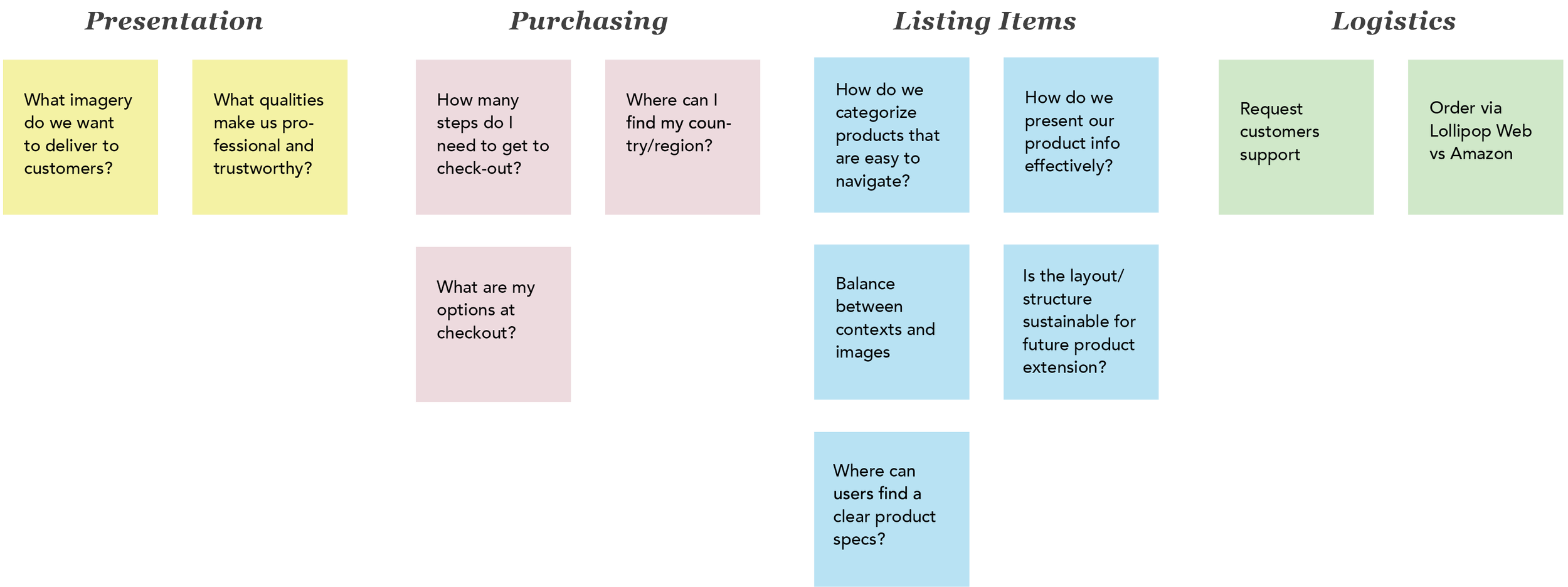
AFFINITY DIAGRAM
Themes
Our team created an affinity diagram to identify the scope of the website. This exercise helped us decide on the design direction and the four key areas we should work on based on the user survey results and competitor analysis.
USERS NEEDS & WANTS
Actionable Goals
I synthesized qualitative data into actionable goals through journey mapping and competitive analysis.
Easy Purchase Flow
With a wide range of customers globally, we want to ensure users can purchase seamlessly, regardless which platforms they prefer – Amazon or Lollipop’s site.
Accessible Customer Support
Many e-commerce customer support has a dated system that prevents customers from accurately communicating their issues. Customers need effective communication access to establish trust and loyalty to the brand.
Effortless Shopping Experience
Being new parents is a lot of work and having to read through paragraphs of product specs is painful. A clear presentation of our products that deliver is much needed.
Establish Brand Voice
It’s not all about business. Millennial consumers also care about if a brand’s value aligns with their beliefs. Lollipop needs to establish its brand character and voice to stand out in the industry.
STAKEHOLDERS MAPPING
Meet the Users
This is Kimberly.

Kimberly, 32, a new mom, is always on the search for the best products for her baby. She relies on recommendations from other moms that are in the same boat. She also follows mommy YouTubers and instagrammers for lifestyle inspo. When she shops, she cares about product safety, reviews from other buyers and of course, is it cute?

This is Lindsay.
Lindsay, 28, grad student, starts getting invites to baby showers as many of her friends got married in recent years. With heavy workloads, it’s quite a hassle for her to go through tons of options comparing which brand is better. She wants to spend as little time as possible shopping. To her, a trustworthy and straightforward online store that gets to the point is all that matters.
What Does Our Boss Want?
After numerous meetings with Lollipop’s key decision-makers, our team did a feature prioritization vote on what would be the most valuable.

REFRAMING THE PROBLEMS
Poorly Formed User Flow Caused Insufficient Shopping Experience
Besides Amazon, many small baby care businesses rely on Shopify for easier website maintenance, and in turn, this norm exacerbates the formation of similar site outlooks from different brands in the baby care market. Problematic user flows consist of ambiguous information and inefficient routes which causes confusion. Although official sites give more rooms for brand characters to breathe, additional shopping effort is required from shoppers which leads to frustration and wasted time.
“As a startup business, how might we make a brand official website that gravitates visitors to stay, with the limited resources and business constraints we have?”
As a result, our proposal was to recreate Lollipop’s online shopping experience on behalf of our new parent buyers, following RWD guidelines for seamless adaption on various devices.

DESIGN METHODOLOGY
Fitts’ Law
The Fitts’ Law is widely used in user experience, that the amount of time required for a person to move a pointer (e.g., mouse cursor) to a target area is a function of the distance to the target divided by the size of the target, and thus the longer the distance and the smaller the target’s size, the longer it takes.
Ventures often underinvest in easing the minimum user action while over-invest in attempts to increase motivation. As a result, it is crucial to make the minimum action as effortless and quick as possible for the users.


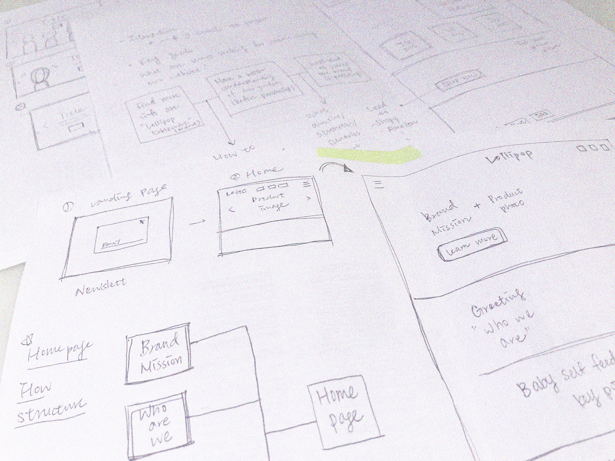
Ideation and Brainstorming
The design team clarified the user flows and started drawing out various iterations of the product pages. We experimented and compared with different blueprints, grouping the vital elements in the most intuitive ways possible.
Info Architecture
HI-FI PROTOTYPE
Introducing Lollipop Baby Care
I identified key issues with the existing product page on Lollipop’s website. Synthesizing research results, I found that users are bombarded by unnecessary information and unclear visuals. Due to the NDA, I cannot show the whole prototyping process. Here are some final screens for the landing and product page user flow.

DESIGN GUIDELINE – DESKTOP
Visual Identity
Going Beyond…
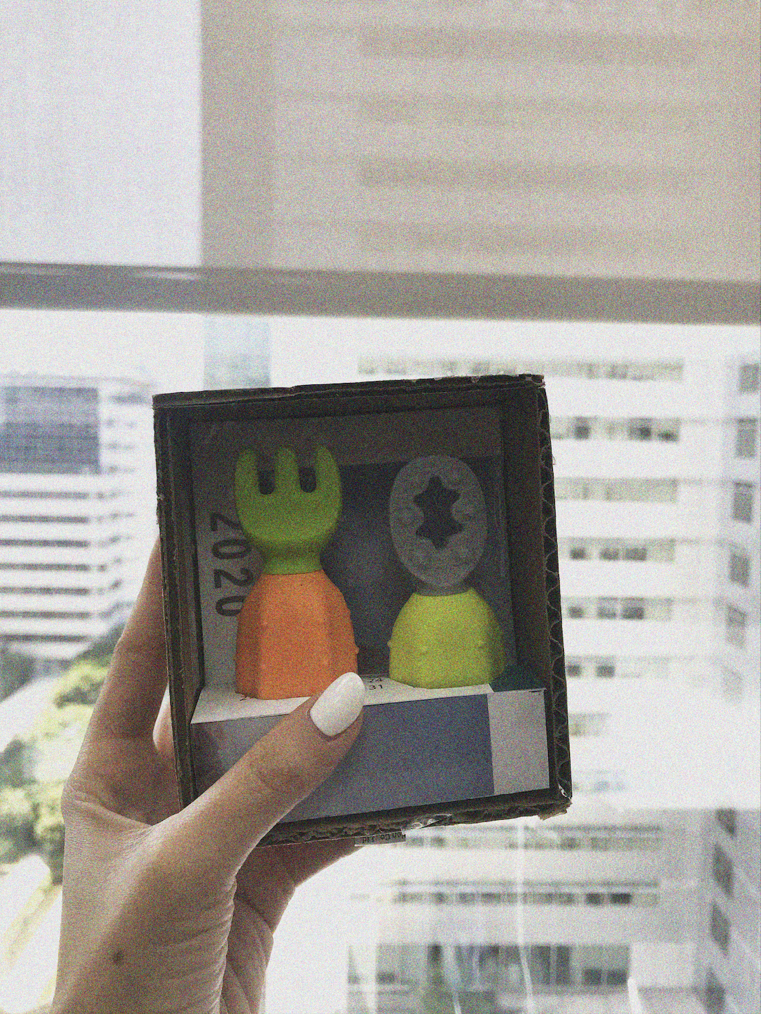
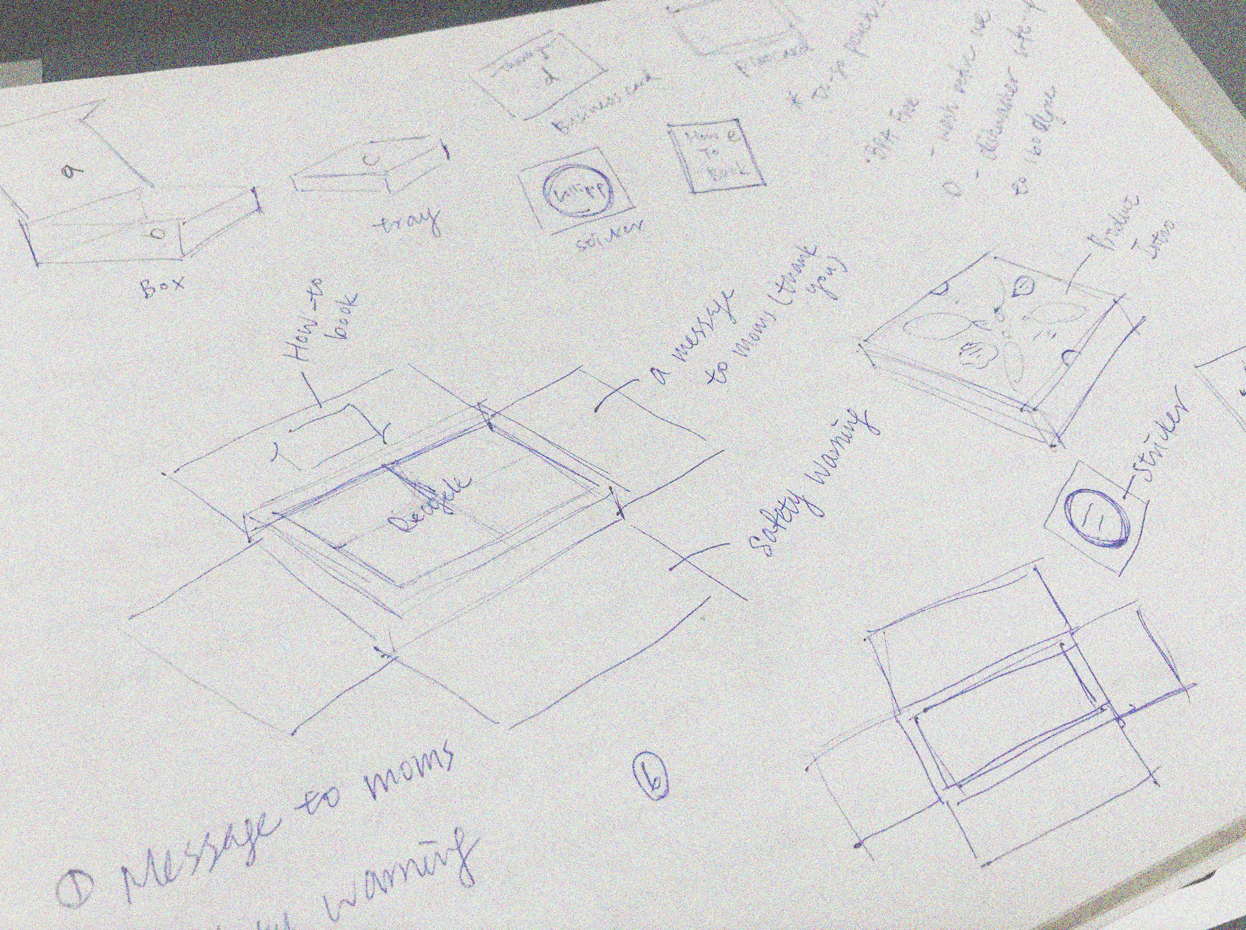
Throughout the project, I had the opportunity to hone not only my UI/UX skills but also my packaging design sense. I participated in another project with two Industrial Designers, creating various unboxing experiences for Lollipop Tableware. I took the time to craft different 3D explorations with a storytelling theme of “children book for new parents”.

The Dream Team 🚀
Big shoutouts to these warm and inspiring colleagues who helped me every step along the way. I’ve grown immensely as a well-rounded team player through this project. Never had I thought about I would be in charge of a website rebranding as a college recent grad. I’m very grateful for all the love and support from these amazing fellows. Can’t thank them more enough for believing in me.

Problem-solving on a strict timeline
This challenging project taught me how to prioritize features and balance between business and engineering constraints under a strict timeline. With cross-team meetings taking place every week, the expedited sprints gave me the opportunity to hone my prototype and UX writing skills.
Proactive team player
Besides crafting pixel-perfect screens, I got to practice my communication skills with engineering and the R&D team, understanding their thought process and following their needs through rounds of iterations. With the help of our senior designer, I developed scalable designs that resolved edge cases.